Build your own page for YouTube Music
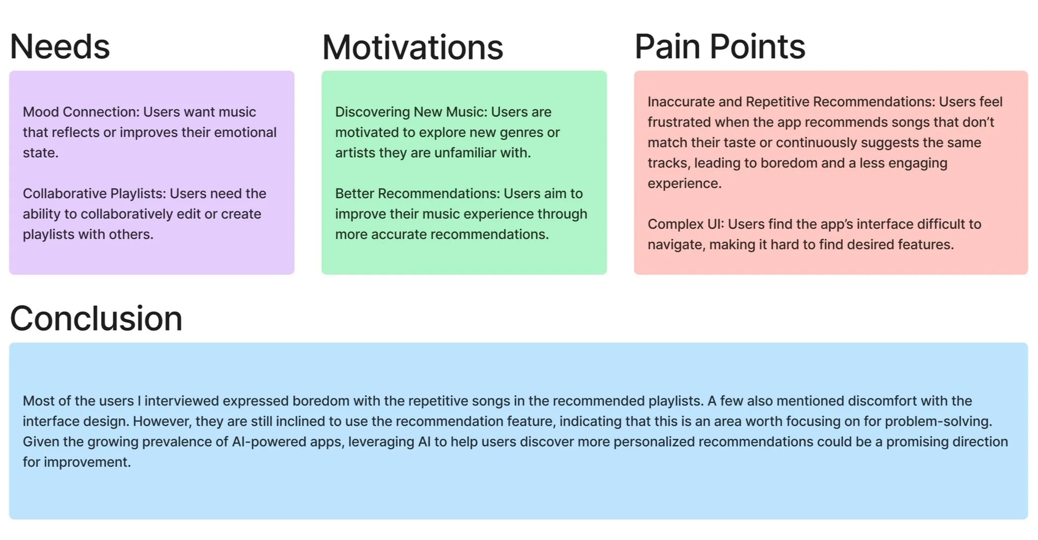
Are you bored with your music recommendations?
Music apps often serve up the same tracks over and over, leaving listeners feeling like they're stuck in a loop of repetitive suggestions. Users crave a more tailored experience that truly reflects their evolving tastes and unique preferences. This project focuses on addressing this issue.
Details: Add a feature for YouTube Music
Role: UX design / Ux researcher
Duration: July 2024 to Oct 2024
Tool: Figma, FigJam
This project started with…
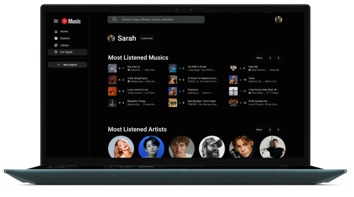
This project started with the idea of using a recap feature to improve music recommendations for users. However, as the project developed, I realized there were too many limitations to implement the recap approach fully. This led to a pivot toward a more flexible filter system that could still serve the goal of personalizing recommendations effectively.
Methods for identifying problems
User Interview
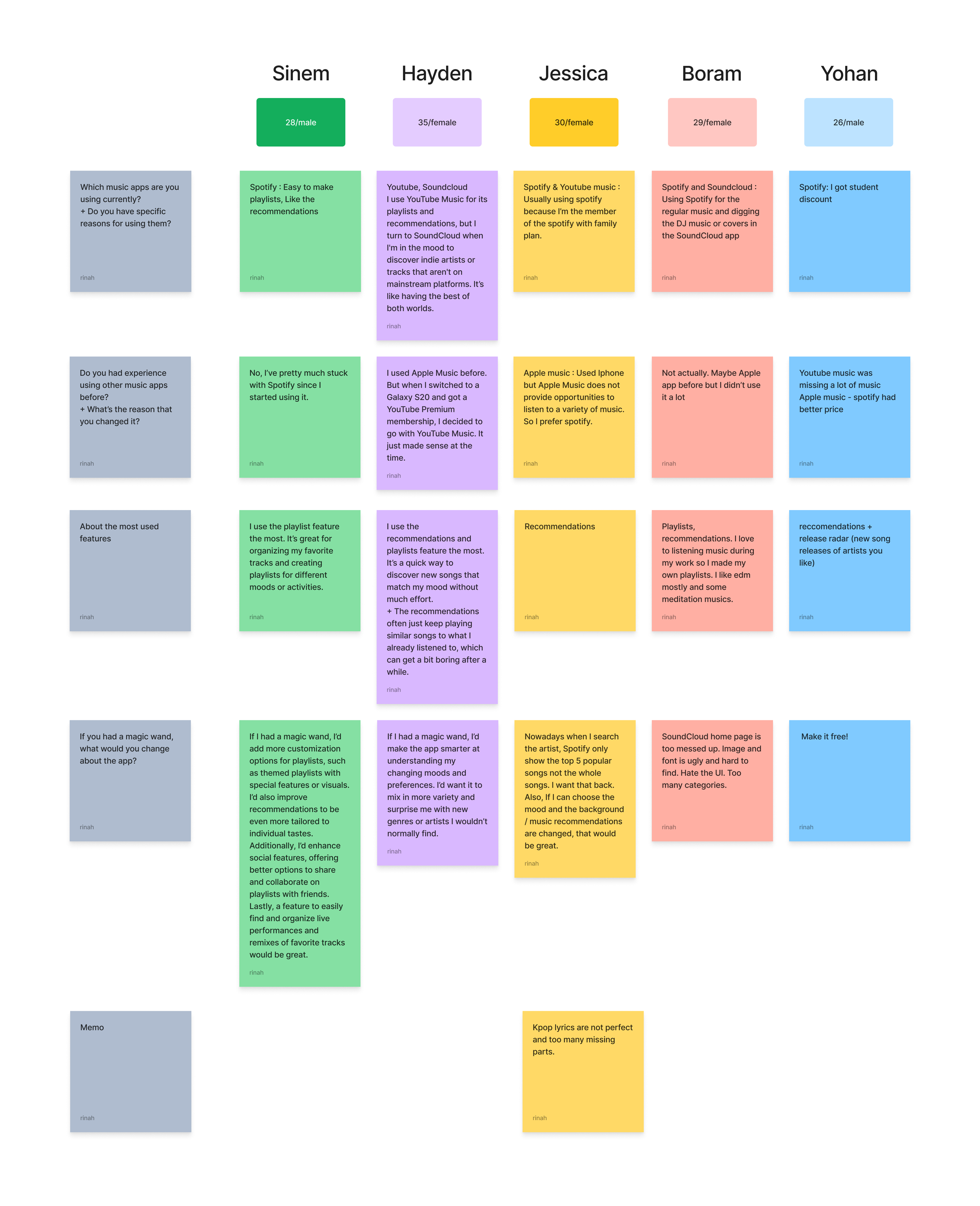
I found 5 participants who are using the music apps in their lives.
Affinity Map
With user interview, I conducted results to affinity map to using the FigJam. Here are key findings,
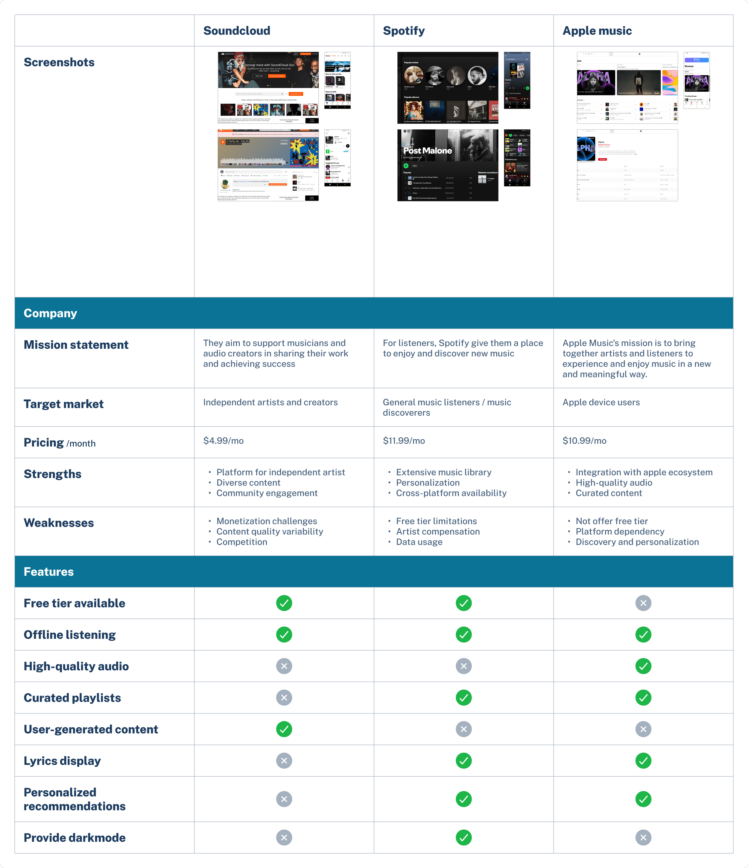
Competitive Analysis
To better understand the current landscape of medication reminder apps, I conducted a competitive analysis of two existing apps: Medisafe and Pill Reminder & Medication Tracker. By comparing these services, I was able to identify what features are already commonly provided and, more importantly, what areas still have room for improvement. This analysis helped me explore opportunities to enhance the user experience by addressing gaps that are not fully covered by existing solutions.
In addition, I looked into Timely, a general alarm app, to evaluate how its alarm system delivers a more intuitive and flexible user experience. This helped me gain valuable insight into what kind of notification and scheduling system users might find more convenient in a medication-focused context.
Overall, the competitive analysis informed key design decisions and guided the direction of my app concept—ensuring that the final product not only meets basic expectations but also introduces features that feel thoughtful and user-friendly.
Persona
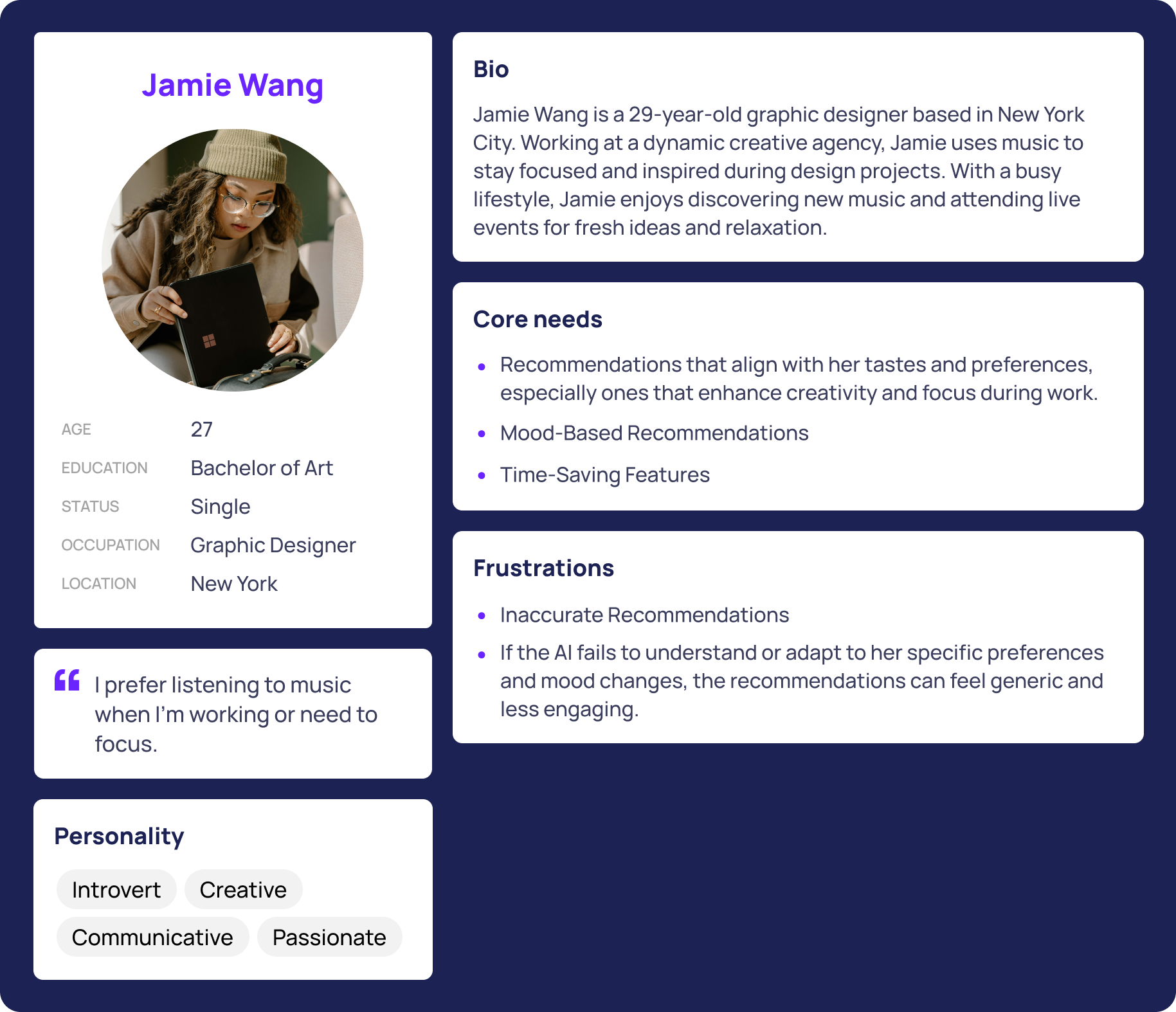
I made persona named ‘Jamie’ based on the research result. This persona represents an average person who experiences common daily inconveniences, allowing us to focus on the pain points and challenges they encounter in their everyday routine.
What will I build?
I want to offer a service where users of a music app can customize their pages in the way they prefer, allowing for a more personalized experience.
Point of View:
I’d like to explore ways to help YouTube music users discover personal recommendations with new music.
HMW Question:
How might we enhance YouTube Music to deliver better personalized recommendations that introduce users to new music?
Point of View: I’d like to enhance YouTube Music so users can effortlessly find new music that fits their moods and activities.
HMW How might we simplify the process for YouTube Music users to discover music that perfectly matches their current mood or activity
Prototype and Testing
Low-fidelity Wireframe
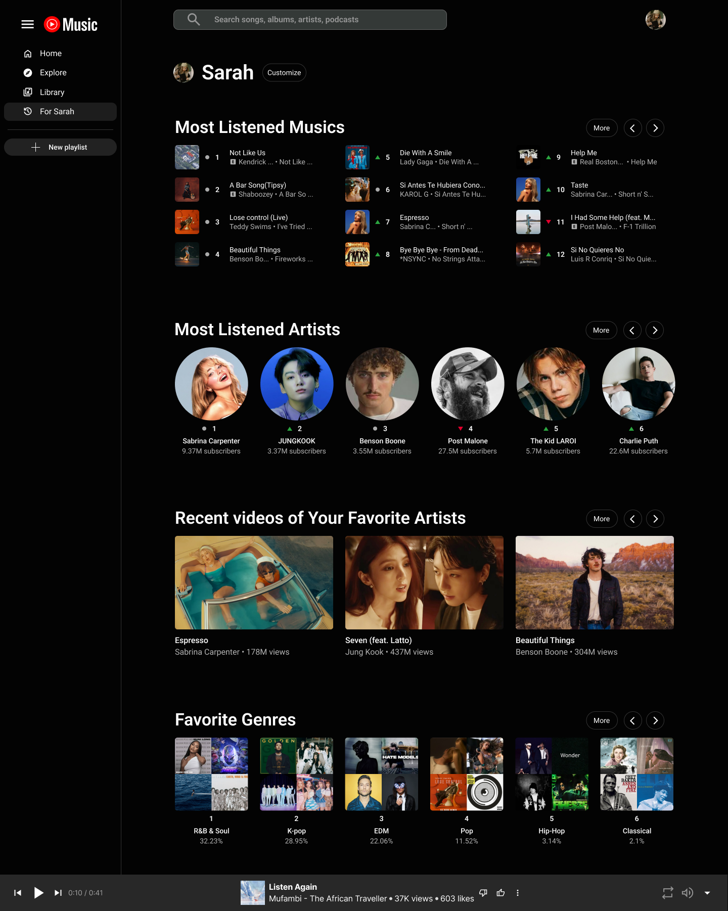
In the early stages of creating the low-fidelity wireframe, I explored a Bento-style layout to group and present content based on user interests. This approach aimed to give users a more intuitive and organized way to engage with their personalized data. For example, in the genre section, I used a donut graph to create a fun and visually engaging element—offering users an entertainment-like experience while satisfying their curiosity about their own listening patterns.
Usability Test Result
After completing the wireframe, I conducted a usability test with participants from the previous interviews. The goal was to evaluate how satisfied users were with the suggestions.
Main Questions:
How well does this page support building user interest?
Is there any lack of information?
Can you identify any specific elements you liked or disliked?
Findings:
All participants accepted the design but noted that its visual style is inconsistent with YouTube Music’s existing interface.
Additionally, the suggestion section felt too limited to some users. They did not seem to receive enough personalized recommendations, highlighting the need for improvements in this area.
Problem Solve
Final Prototype
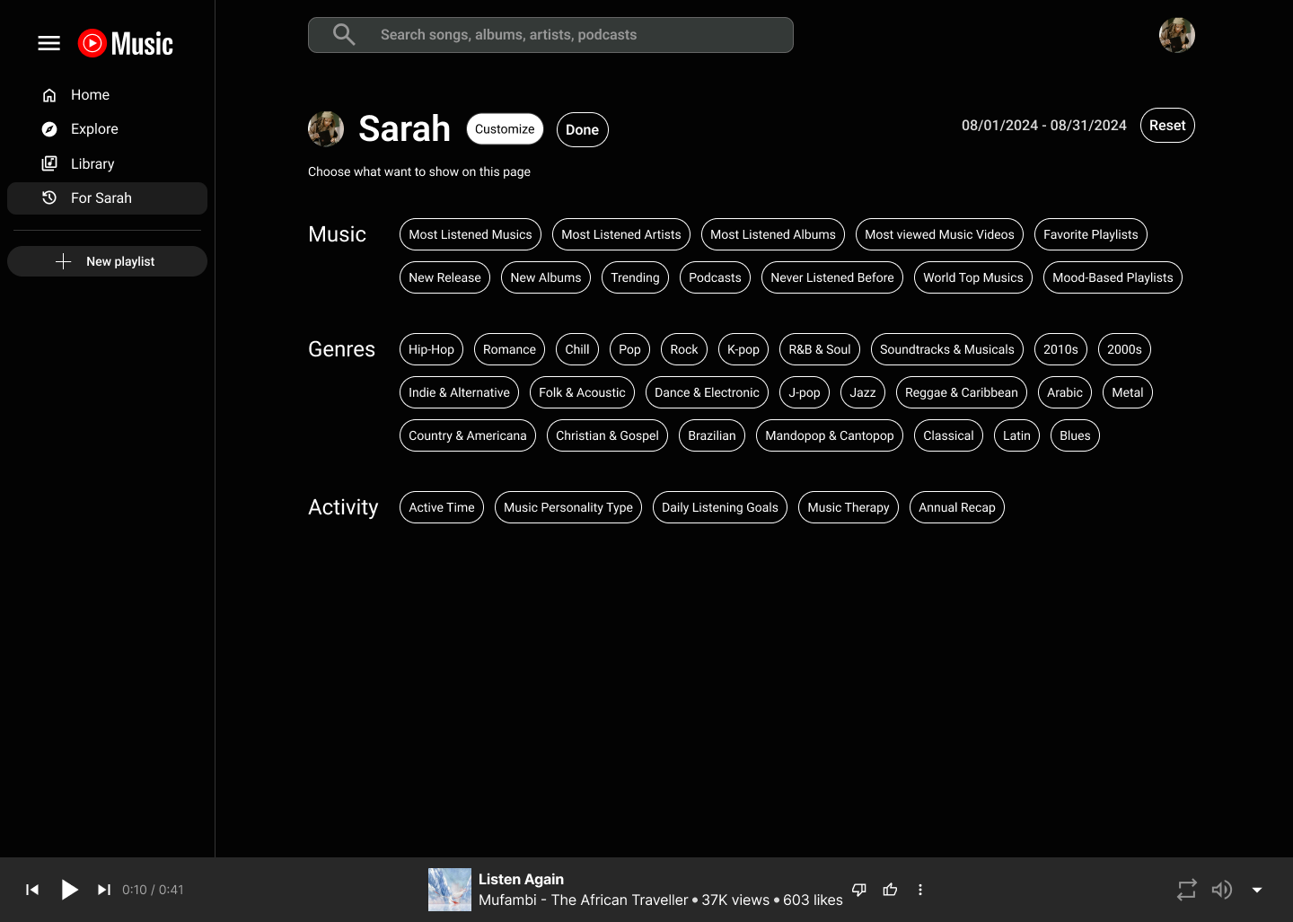
Multiple filters applied
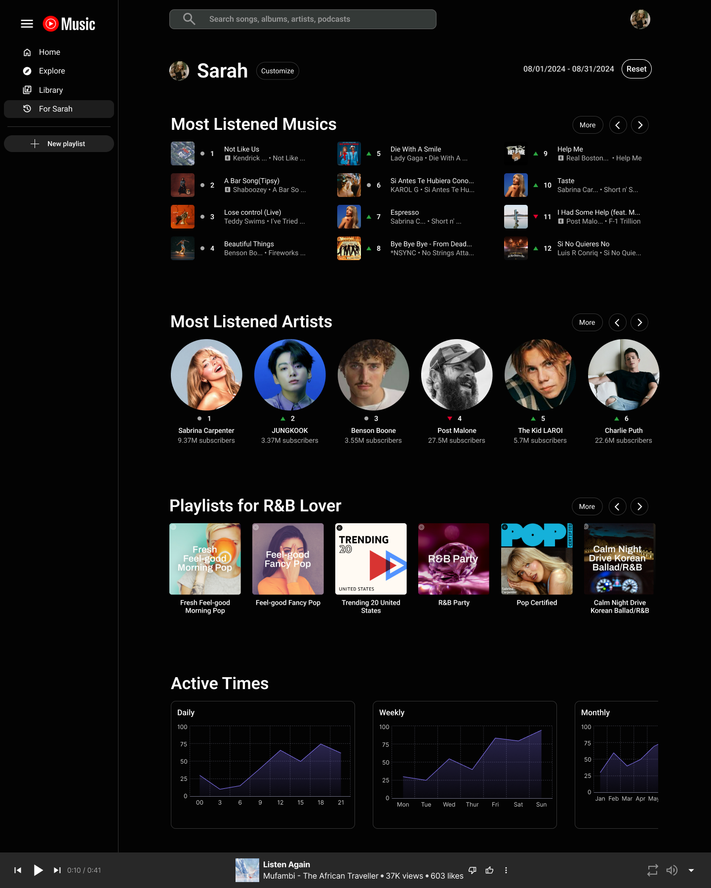
To enhance the personalized experience, I introduced a customizable suggestion feature that allows users to tailor their music recommendations to their unique preferences.
By enabling users to select from various music genres and playlists, this feature empowers them to take control of their listening journey.
Not only does it help users discover more about their own taste in music, but it also encourages long-term engagement by allowing them to save their settings, ultimately reducing the likelihood of switching to other platforms.
One filter applied
If you want to check my full prototype, please click Rinah.s.design_YouTubeMusic
Final thoughts and takeaways
This project taught me the importance of staying flexible throughout the UX process. What I originally planned shifted significantly as I conducted user interviews and moved deeper into the design phase. Listening to real user needs challenged many of my initial assumptions and pushed me to rethink how features should be presented or prioritized.
I also realized that working on a redesign comes with its own unique set of limitations. Unlike building something from scratch, redesigning an existing product requires balancing creativity with structure—working within the boundaries of what already exists while still trying to improve the experience meaningfully.
Overall, this experience helped me grow not just as a designer, but as a problem-solver—reminding me that great design comes from both empathy and adaptability.

