Redesign the ‘Stereoscope coffee’
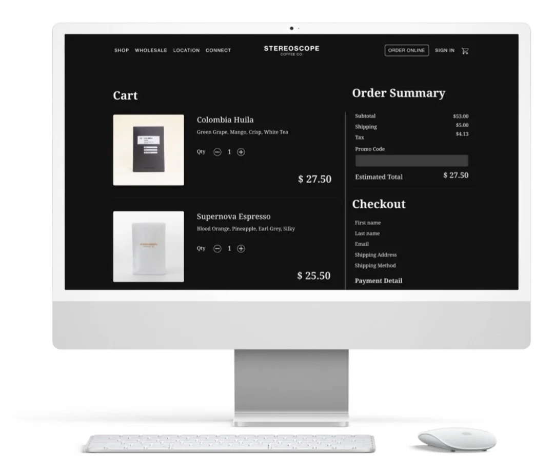
Stereoscope Coffee is a café that roasts its beans in-house, offering customers a variety of specialty beverages. The café is also known for its wide selection of coffee beans, which are available for purchase on its website.
I explored the perspective of existing users and identified several issues, which led me to start this project in order to address and resolve them.
Details: Redesign the existing site
Role: UX/UI design / UX researcher
Duration: July to Oct 2024
Tools: Figma, FigJam
This project started with…
This project aims for a user-centered UX design. I researched improvement methods by focusing on the inconvenience of the website's user flow.
I found that Stereoscope Coffee did not prioritize a user-friendly interface, and I am addressing this issue.
Methods for identifying problems
User Interview
I had 5 participants, mid-20s to mid-30s.
Main questions:
Do you have any experience buying beans from the coffee website? How was it?
Is there any specific information you always check when purchasing coffee beans?
Have there been any positive or negative experiences during your purchase?
Do you think the atmosphere of the website influenced your decision to buy?
What do you prioritize when deciding between similar products?
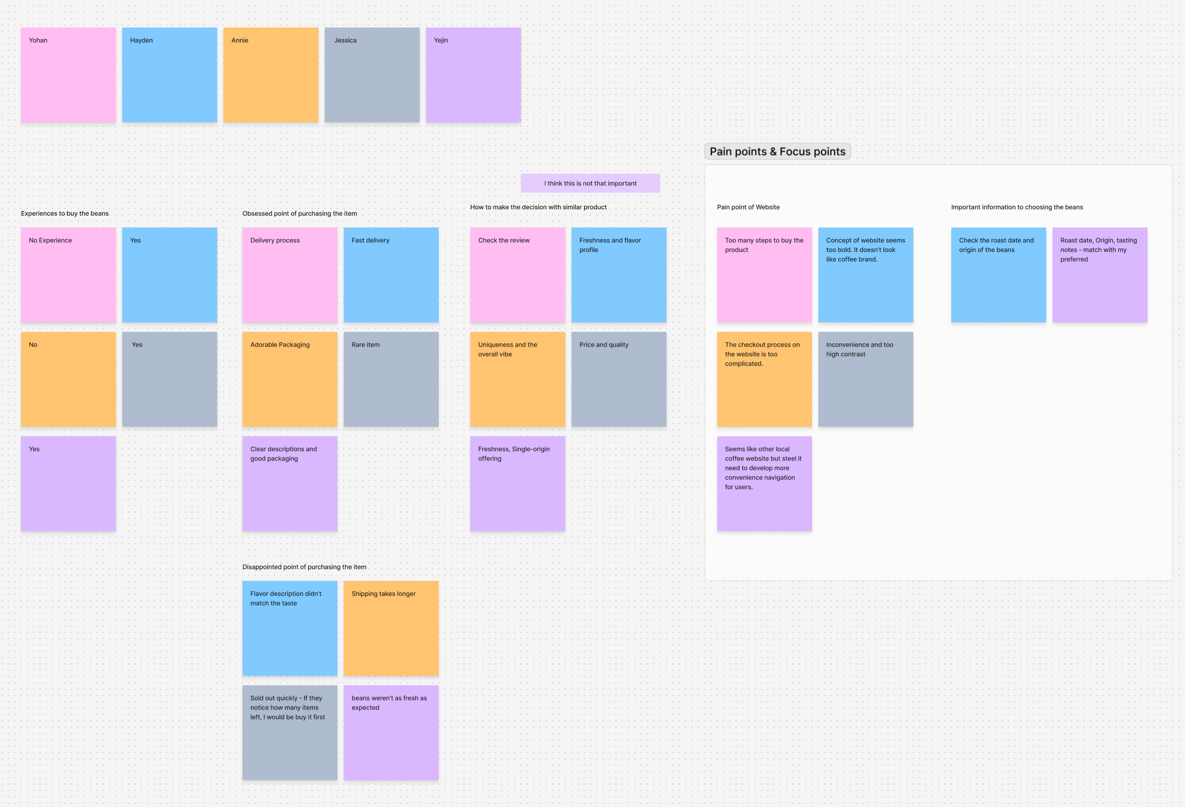
Affinity Map
Conducting interview result, I created affinity map to summary.
Key points
Checkout Process Complexity: Most users found the checkout process cumbersome due to an excessive number of steps.
Information Accessibility: Users experienced difficulty comparing coffee beans due to extensive scrolling and low readability of key details.
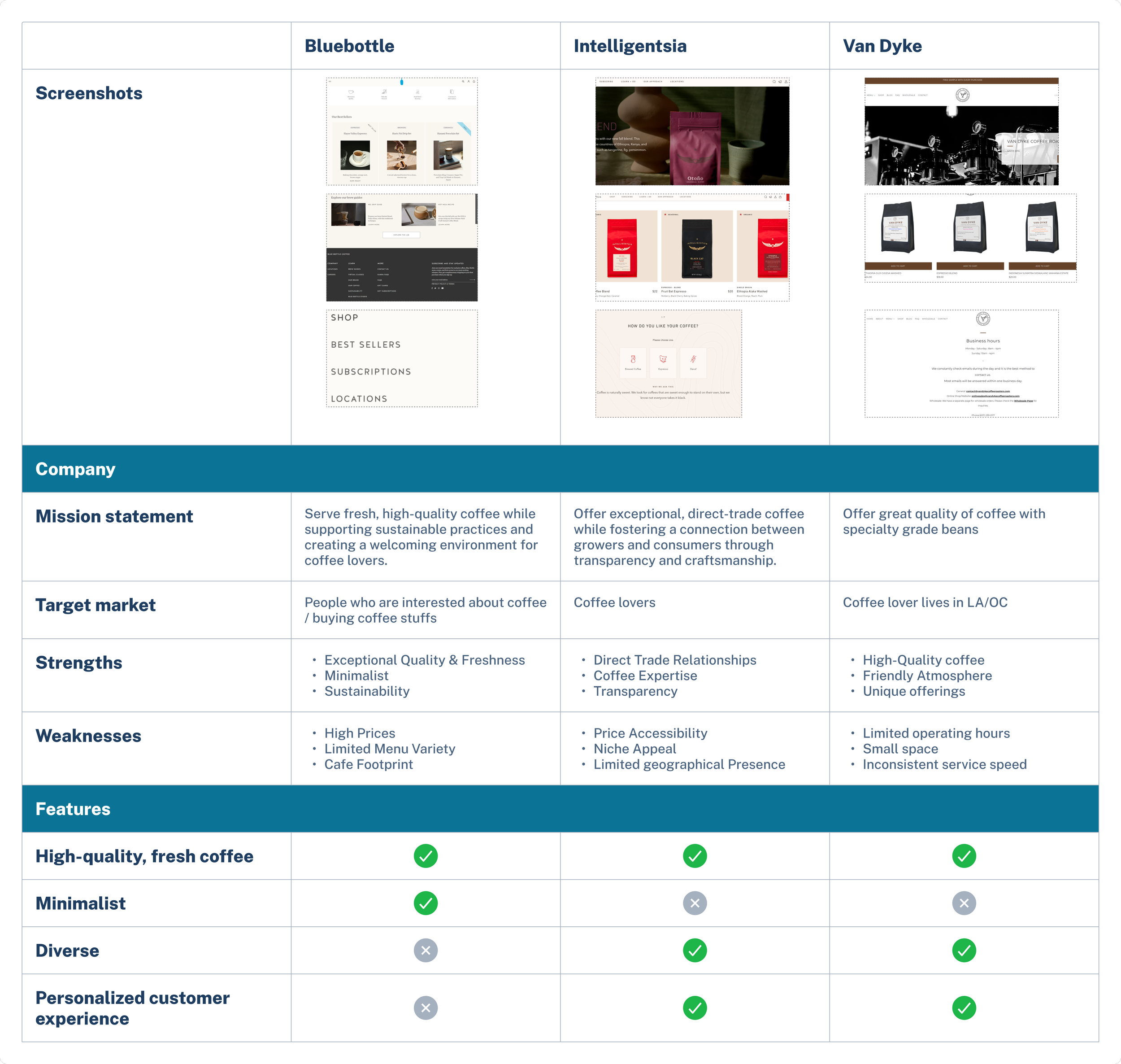
Competitive Analysis
I compared 2 popular coffee brands named ‘Bluebottle,’ and ‘Intelligentsia.’ and also one of local brand named ‘Van Dyke’
Personas
I created two personas based on the user research. The persona 'Wendy' is designed as a coffee enthusiast with extensive purchasing experience, highlighting the challenges she faces from the perspective of a coffee connoisseur. On the other hand, the persona 'Emma' is set up as a beginner who purchases coffee for the first time, capturing the difficulties she encounters in that role.
What will I build?
All interview participants reported feeling discomfort during the checkout process. I wanted to clearly identify and address the issues in this area with more detail and precision.
POV 1: A coffee enthusiast wants to easily and quickly find a variety of high-quality coffee beans and purchase them conveniently.
HMW 1: How might we optimize the search and filtering system so customers can quickly and easily find the coffee beans they are looking for?
POV 2: A coffee business wants customers to purchase more frequently and build trust in the brand by providing a convenient and satisfying shopping experience.
HMW 2: How might we offer a convenient purchase process that encourages repeat purchases and strengthens brand loyalty?
POV 3: A website developer wants to provide users with an intuitive search function to simplify the coffee selection process and enhance the overall user experience.
HMW 3: How might we improve the coffee-buying process by providing user-friendly features that simplify the shopping experience?
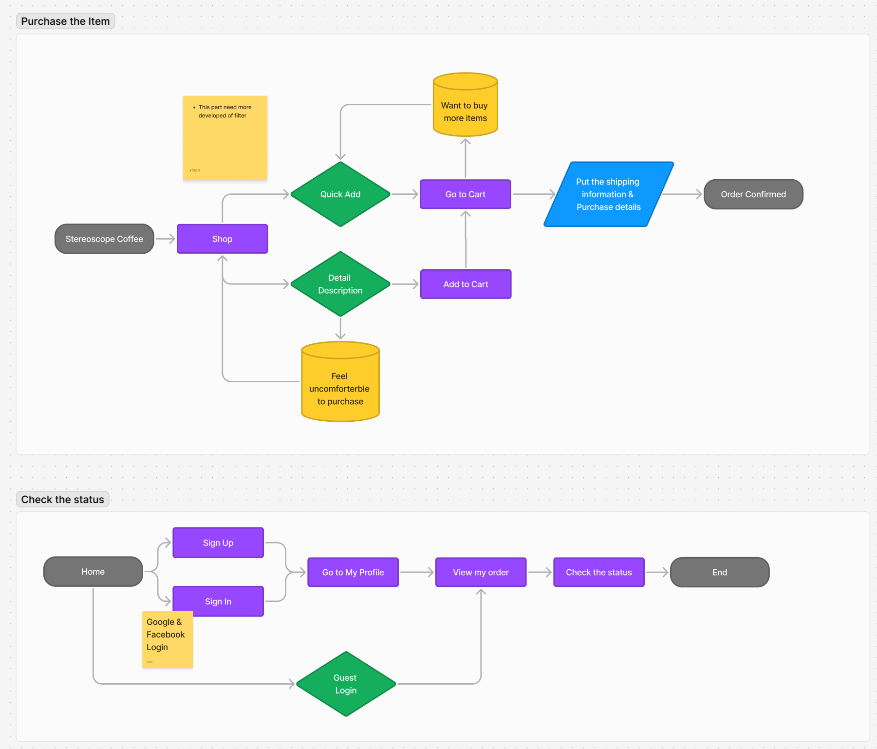
User Flow
Prototype and Testing
Low-fidelity wireframe
Wireframe based on the user flow. The goal was to ensure that the overall flow is easily visible at a glance.
Usability Test Result
I conducted user testing with five participants to gather feedback on a low-fidelity wireframe and the user flow for purchasing an item.
Key Findings:
The overall purchasing process was smooth and intuitive.
Participants suggested the following improvements to enhance usability and clarity:
Recommendations:
Payment Details Visibility: Introduce an accordion-style dropdown for payment details to protect users' personal information.
Best Seller Highlight: Add a badge or small icon to indicate best-selling items for better visibility.
Promo Code Entry: Include a dedicated text field for promo codes to ensure users can easily apply discounts.
Problem Solve
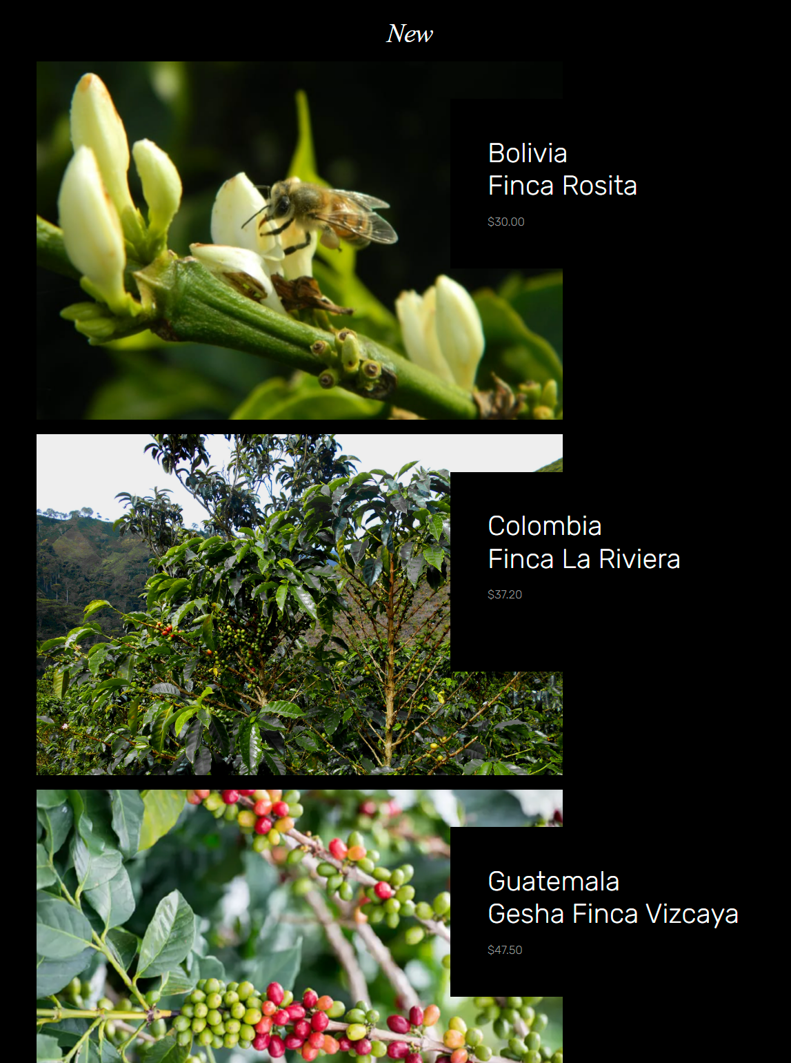
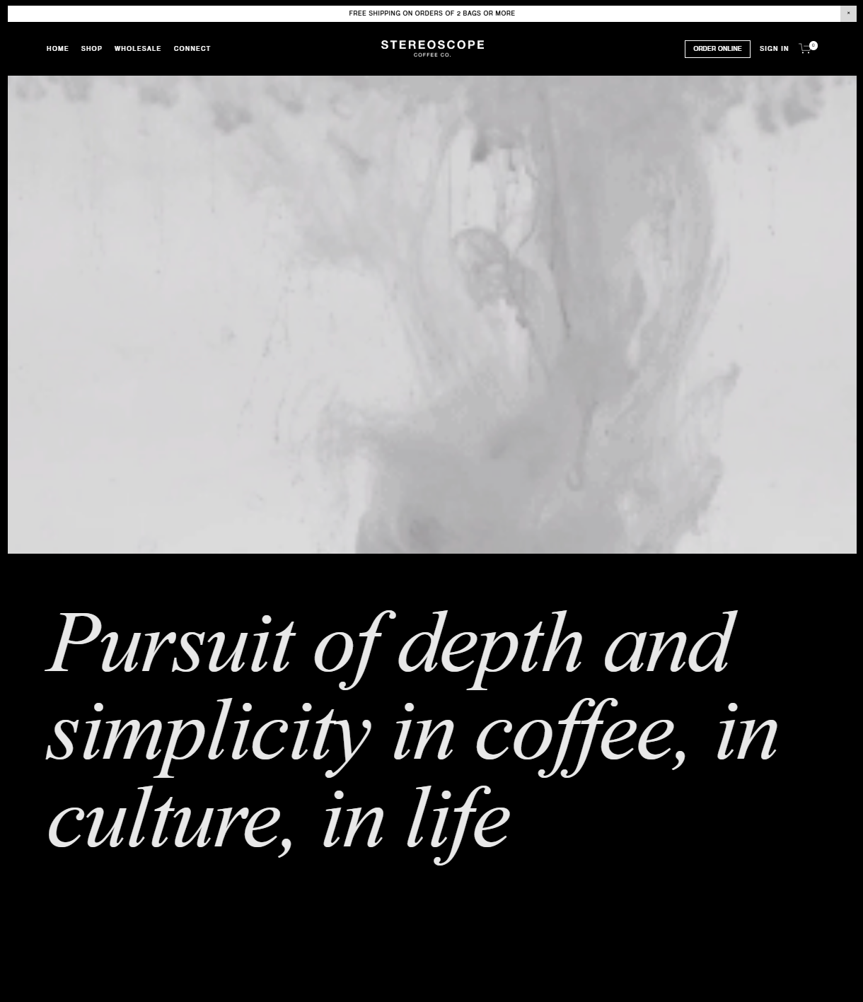
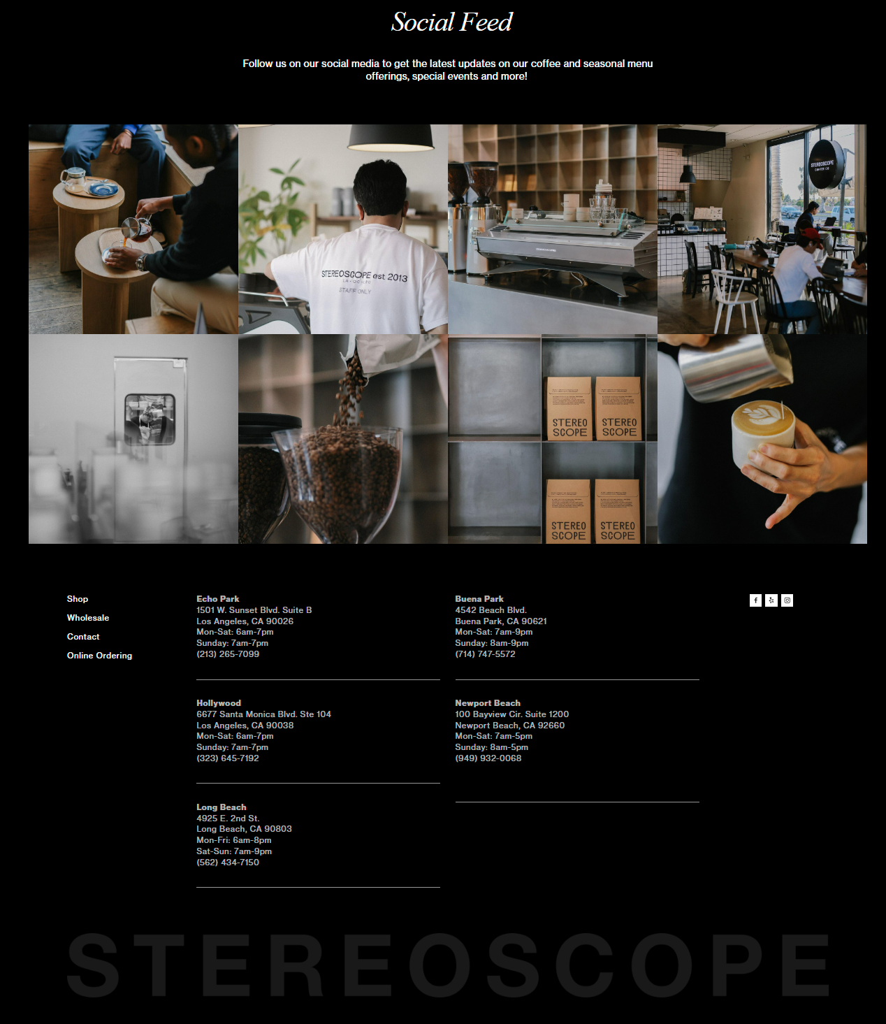
Stereoscope original home page (Left to right)
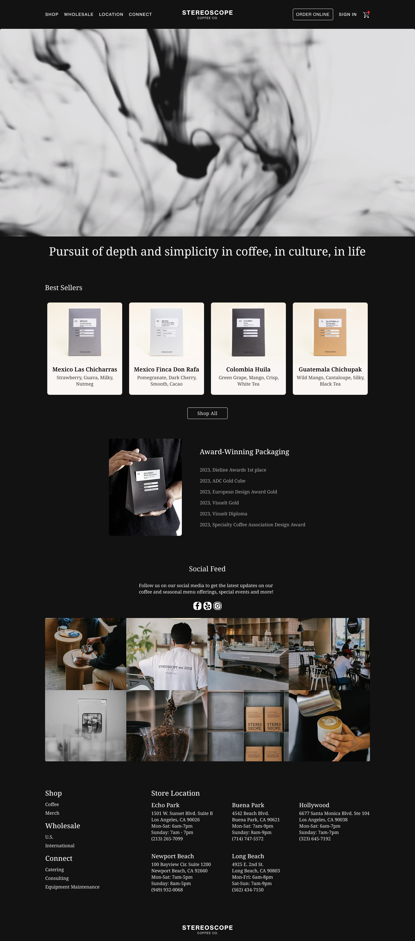
Redesigned home page
To address the issues raised during user interviews—specifically low readability and the inconvenience of excessive scrolling—I made the following improvements:
First, I reduced the font size of the catchphrase to enhance visual hierarchy and make better use of space.
Second, I organized the images and titles of new items into card containers, allowing for more efficient space usage.
Additionally, I introduced a hover feature on each item card that displays an “Add to Cart” button, improving user convenience by enabling quicker and easier purchases.
For the “Award-winning Packaging” section, I placed the key achievements at the center of the screen to immediately capture users’ attention and highlight the brand’s major awards at a glance.
Original shop page
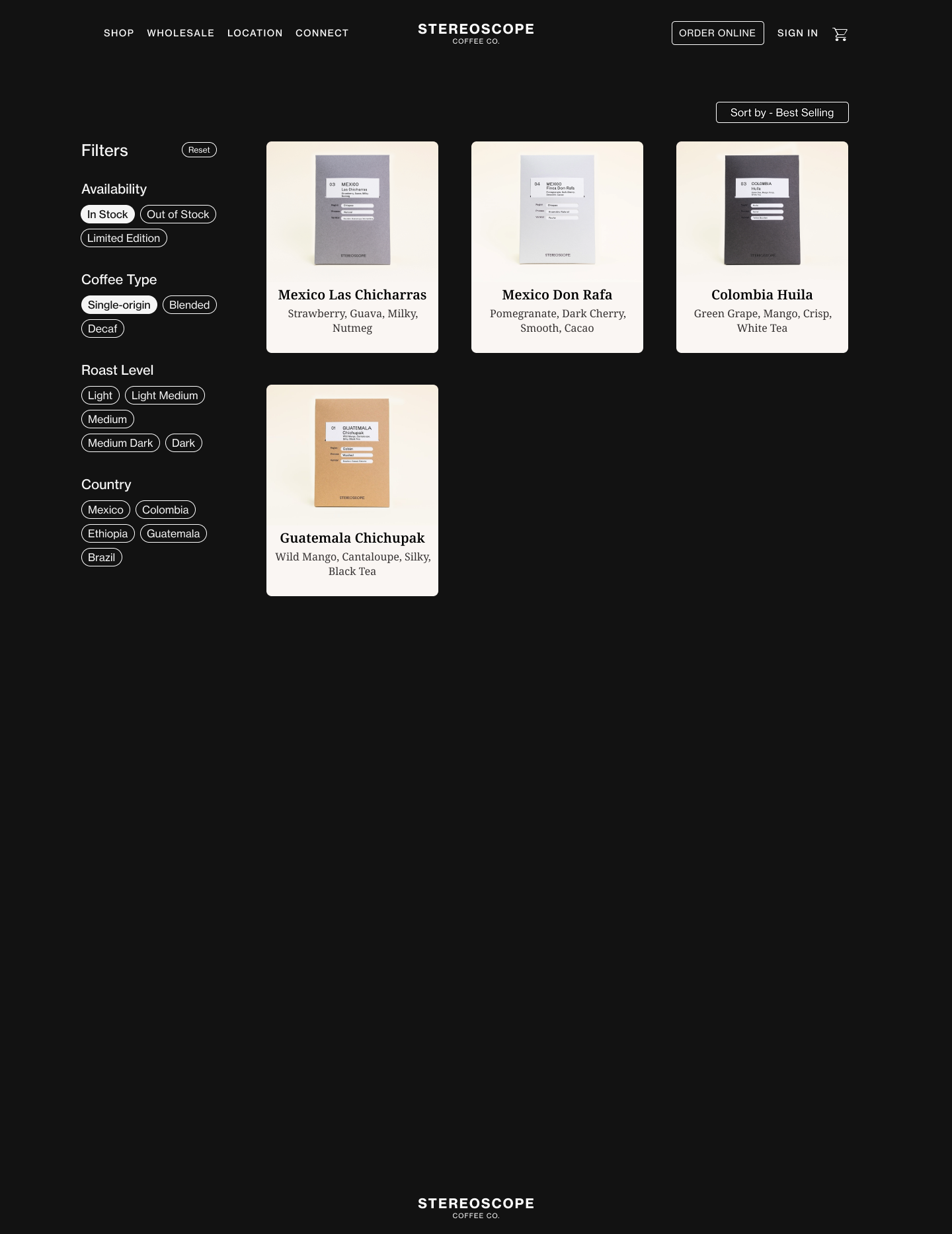
Redesigned - Shop with filter
I introduced a filtering system on the Stereoscope shop page to help users quickly find the items they want rather than simply displaying products in a list.
By applying this filter, users can quickly understand the taste profiles of each coffee, allowing even first-time visitors to easily navigate the site.
These cards also include a hover effect that reveals an “Add to Cart” button, which helps shorten the purchasing process and reduce user fatigue.
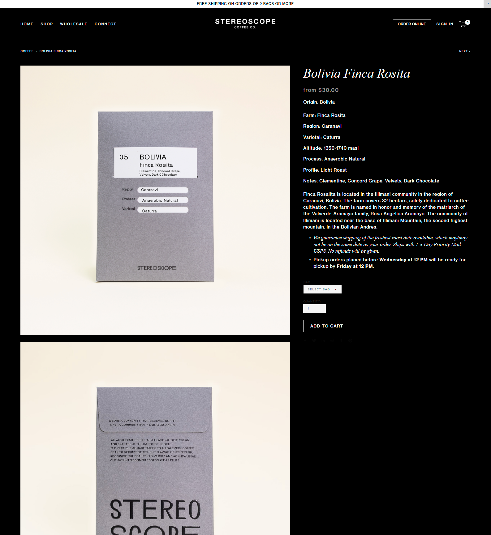
Original - Detail page
Redesigned - Detail page
On the item detail page, I redesigned the layout to visually communicate the coffee’s flavor profile more effectively by incorporating a clean, easy-to-read flavor graph.
This visual element helps both seasoned coffee drinkers and first-time buyers quickly grasp the taste characteristics at a glance.
I also arranged the information and description sections side by side to create a more balanced layout and enhance overall readability.
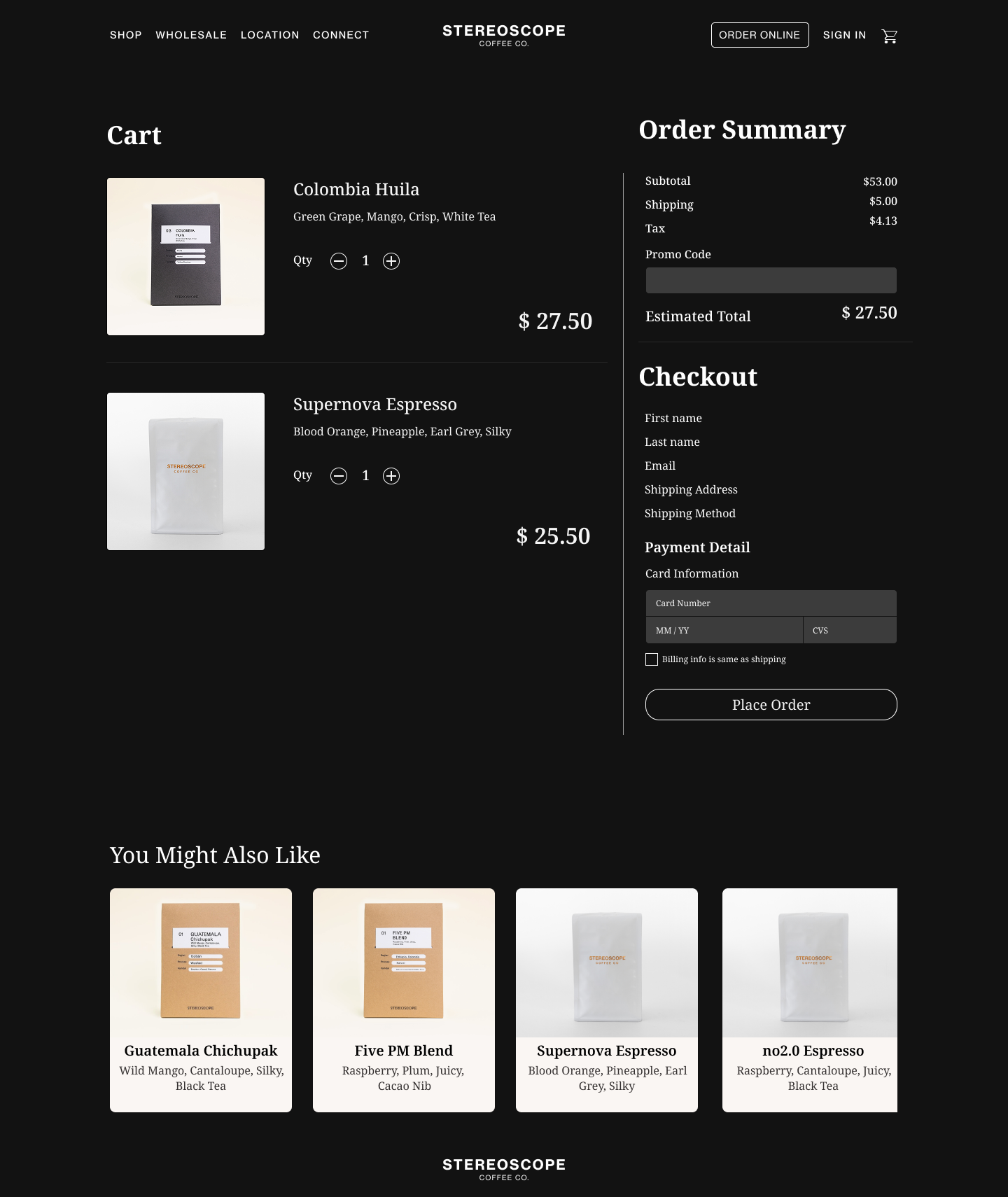
Original - make a purchase
Redesign - make a purchase
If you want to check my full prototype, please click Rinah.s.design_Stereoscope
The original checkout process consisted of two separate steps: users had to go from the cart to a separate checkout page to complete their purchase.
I simplified this flow by combining both steps into a single screen, allowing users to review their selected items and complete the payment in one place.
This streamlined approach reduces cognitive load, minimizes unnecessary clicks, and creates a smoother, faster purchasing experience—especially beneficial for users who value efficiency and clarity.
In the My Order section, users can view both real-time delivery status for current orders and a history of their past purchases.
They can also easily edit their profile to update and manage personal information, ensuring a more personalized and seamless experience.
Final Prototype
Final thoughts and takeaways
Through the redesign of the Stereoscope Coffee website, my goal was to create a smoother and more intuitive shopping experience while maintaining the brand’s premium and minimal aesthetic. By identifying key user pain points—such as low readability, excessive scrolling, and unclear purchase flows—I was able to propose targeted solutions that enhance both usability and visual clarity.
From improving content hierarchy and adding hover-based interactions to streamlining the checkout process and introducing filtering systems, every decision was made with the user in mind. This project reminded me of the importance of balancing visual design and function—how clear communication through layout, structure, and flow can greatly reduce user fatigue and improve satisfaction.
Above all, this redesign reinforced my belief that thoughtful UX design can make even a simple shopping experience feel personal, efficient, and enjoyable.

