
Medicheck
Have you ever missed taking your medication?
According to greatgreenwall.org, approximately 59 million Americans regularly use vitamins or supplements, spending an average of $510 annually. But do all these consumers consistently remember to take their daily vitamins, especially with the distractions of a busy lifestyle? Many users find it challenging to stay on track, often forgetting to take their vitamins or medications altogether. That’s where Medicheck steps in, offering an intuitive solution to integrate these essential health habits into their daily routine seamlessly.
Details: Medicine Notification App
Role: UX/UI design / Brand design / UX researcher
Duration: November 2024 to January 2025
Tools: Figma, FigJam

This project started with…
People often need to take various medications and vitamins, many of which require regular and timely doses. However, it can be difficult to remember to take them without constantly checking the time, especially amidst a busy schedule.
This project solves this challenge by providing a seamless solution that helps people stay on top of their medication routines and maintain their health effortlessly, even in a hectic lifestyle.
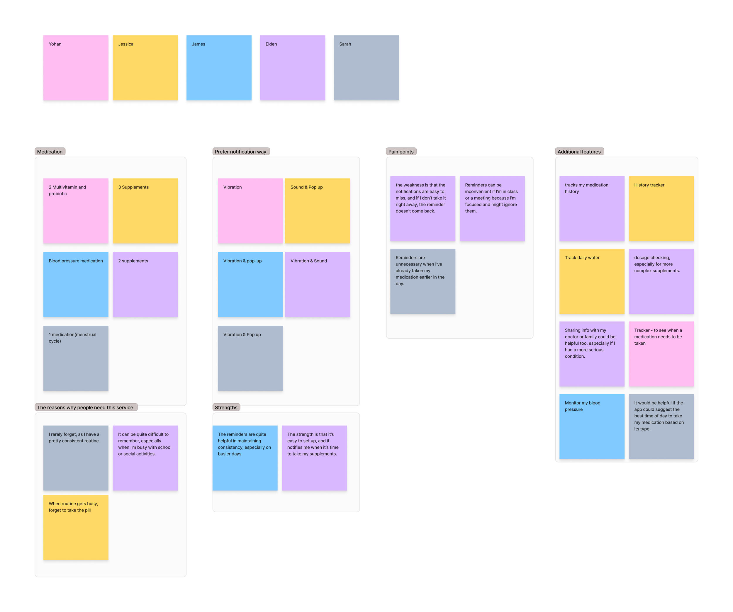
Methods for identifying problems
User Interview
I conducted five interviews with individuals aged mid-20 to mid-30. 3 participants have used a medication reminder app before.
The purpose of this interview is to understand the discomfort users experience when taking medication, and if they have used a medication reminder app before, to learn about what they liked and disliked about it.
Affinity Map
While conducting the interviews, I also started organizing the interview content into an affinity map with FigJam.
Here are the key points discovered during user interviews:
Users had varying preferences for the type of reminders they preferred.
Many mentioned that it’s hard to remember to take their medication once they miss a reminder.
Some expressed that it would be helpful if they could also track their medication history.
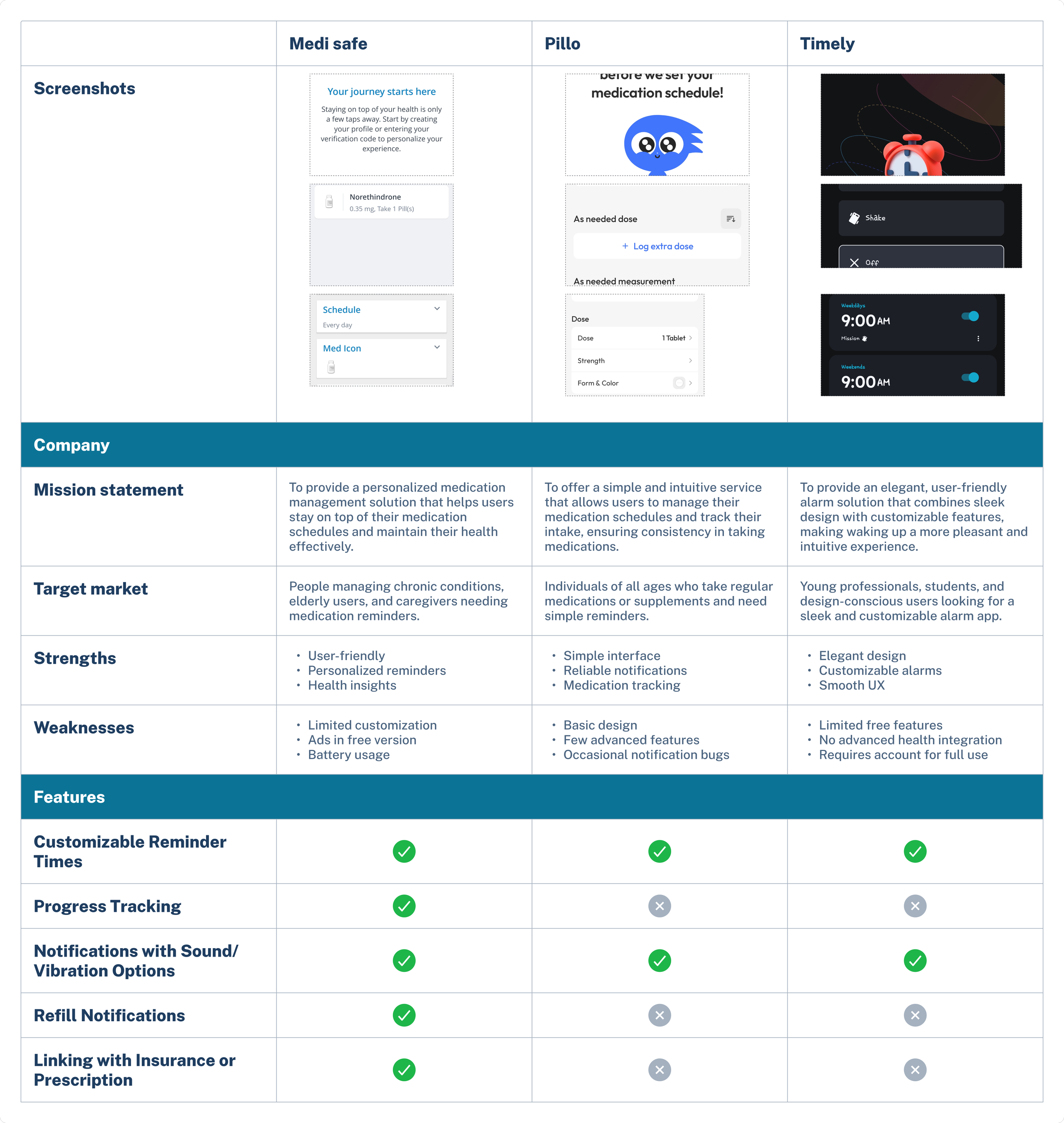
Competitive Analysis
I compared three different notification apps. 'Medisafe' and 'Pillo' are medication reminder apps, and 'Timely' is a sleep tracking and alarm app.
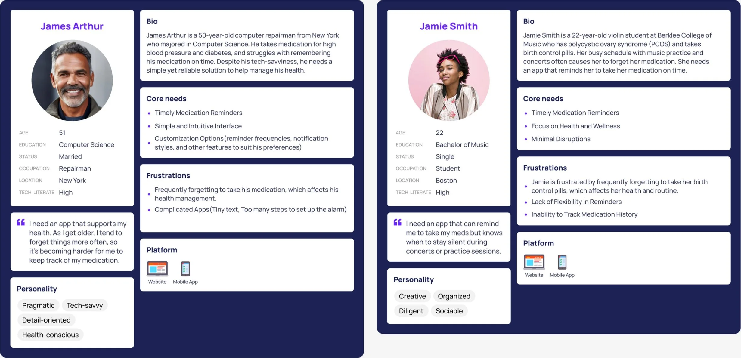
Personas
I created two personas. Both personas were developed based on user research.
The primary persona is James, taking medication for high blood pressure. His core needs are focused on the reminder and easy to use. The second persona is Jamie, who is taking a birth control pill. Her core needs are to focus on minimal disruptions and track the history.
What will I build?
As suggested by the user research, I wanted to create an app that reminds users when to take their medication and gives them a reason to continue using it. To clarify this problem, I organized the POV and HMW.
1. Point of View:
A user who manages multiple medications feels stressed trying to keep track of different doses throughout the day, leading to missed or incorrect doses that could affect their health.
HMW Question:
How might we create a system that helps users easily track multiple medications and provides transparent, timely reminders to prevent missed or incorrect doses?
2. Point of View:
The user needs the ability to customize reminder frequencies and notification styles but feels overwhelmed by too many steps in the process.
HMW Question:
How might we offer customizable reminder options while keeping the setup process simple and easy to follow?
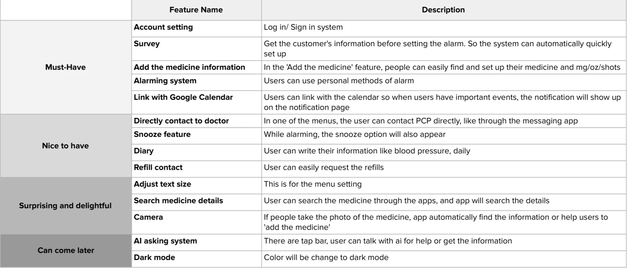
Feature sets
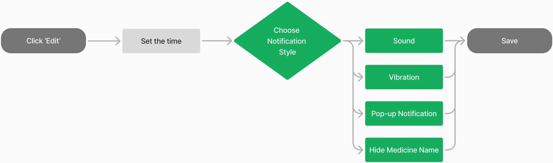
User Flow
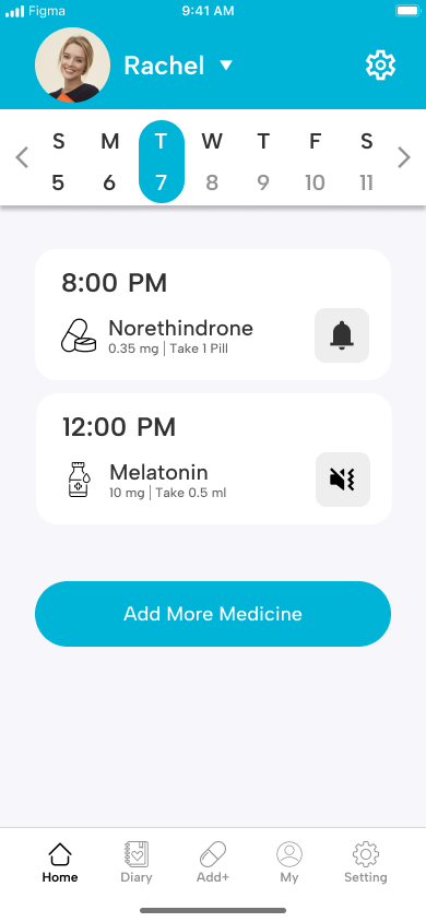
Account setting & Add the medicine
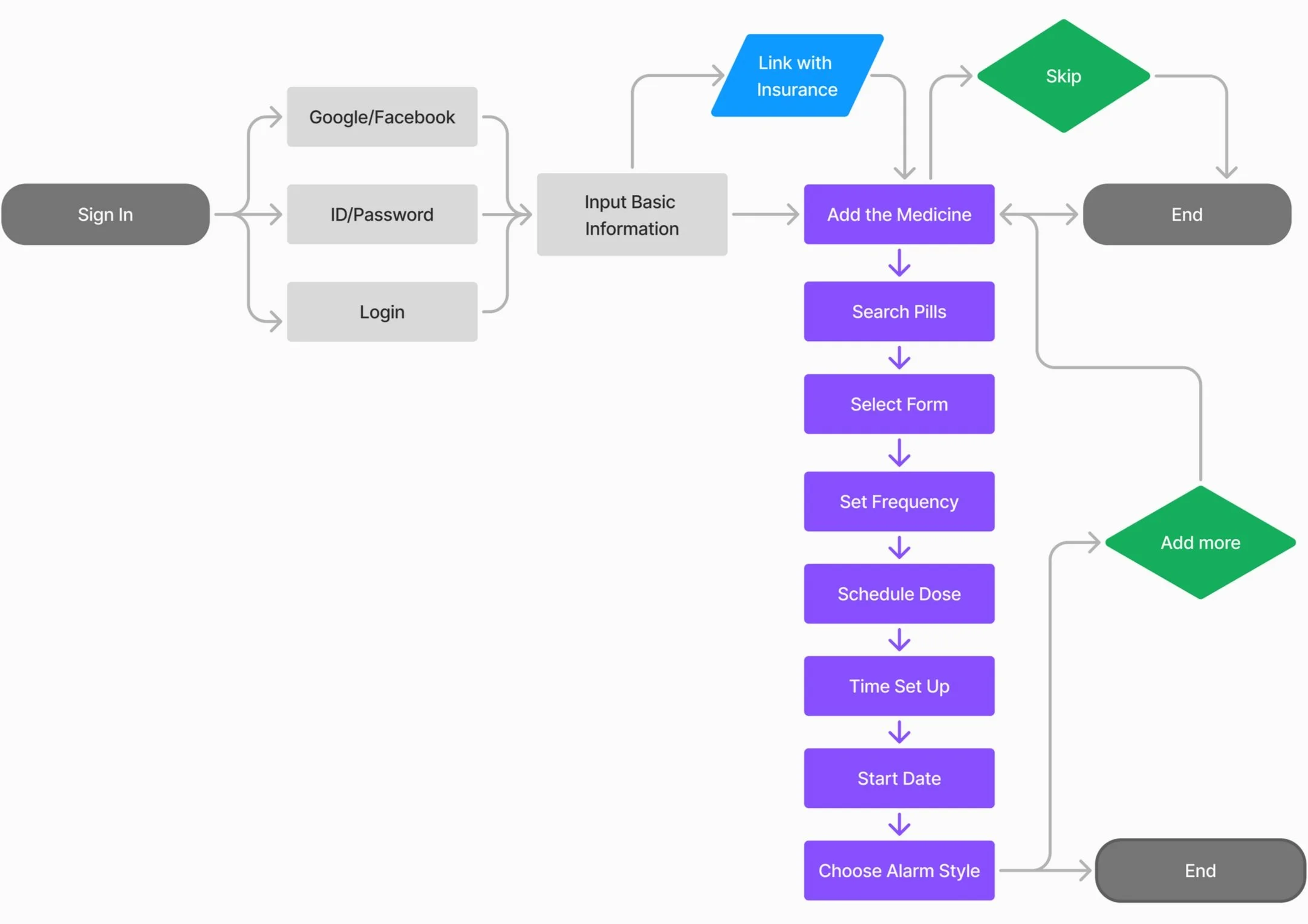
Adjust the notification
Brand Style
Logo

From the beginning of this project, I decided to use the name 'Medicheck,' which holds the dual meaning of taking medication and checking an alarm. Since the meaning was clear, creating the logo wasn't too tricky. I combined the concepts of 'medication' and 'check,' experimenting with various logo designs, and the final chosen design is the one on the right.
Style board

This style board includes typography and a color palette.
Typography
I used the 'Albert Sans' font for the medication reminder app to focus on giving it a professional feel while improving readability with a clean sans-serif typeface.
Color Palette
I choose a blue color for the main. Blue is an excellent fit for medication. It is associated with trust, reliability, and calmness, which can help users feel secure and confident when managing their health through the app.
Prototype and Testing
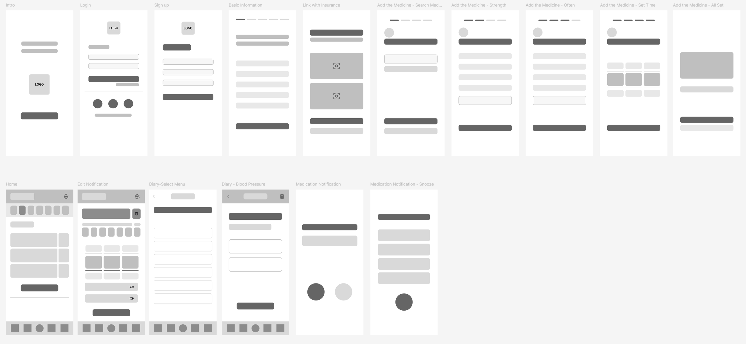
Low-fidelity Wireframe
This wireframe is based on the user flow: Account setting, Add the medicine, Change notification style, Diary, and Notification & Snooze.
Usability Test Result
After I created a low-fidelity wireframe, I had to conduct a usability test to check the entire process.
With 5 participants who already had the interview before, the final goals were:
Does all flow works well?
Does Any task need more development?
Find any ineffective issues.
We found:
All flow works well and is intuitive to follow.
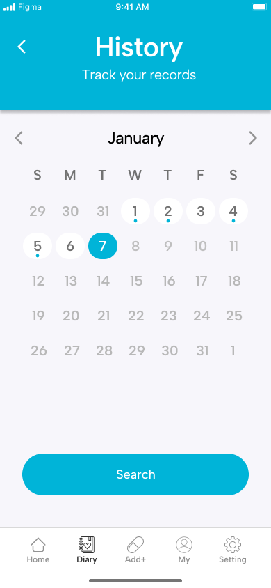
The diary feature needs the history to track the health using the calendar.
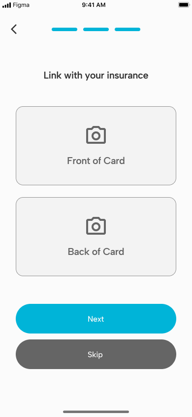
Utilizing a camera feature to search the medicine would be helpful to the user.
Problem Solve
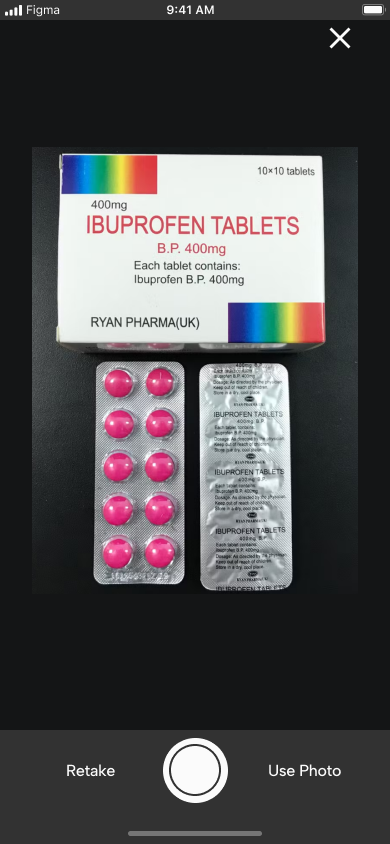
Searching & linking with the camera
This feature reduces unnecessary search steps for users, shortening the time they feel fatigued. In particular, when users take a photo of a pill logo, it analyzes the image and automatically searches for the name, dosage, and instructions, significantly improving convenience.

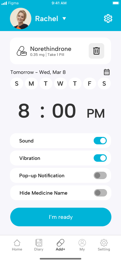
Customize the notification
People will have the freedom to receive alarms in their preferred way. For example, they can only receive vibration or sound and pop-up notifications. The feature that hides the name of the medication can help users who prefer not to disclose this information to others.
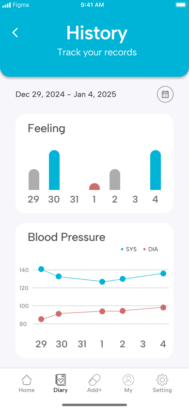
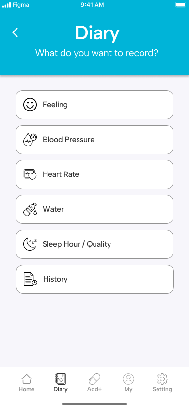
This app provides essential health diary features with a focus on user experience. Offering a calendar format for logging data lets users easily track their health over time and use advanced features like comparison and analysis. This approach minimizes the effort required for manual tracking and helps users gain deeper insights into their health trends, enhancing their overall experience and engagement with the app.
Tracking the health diary
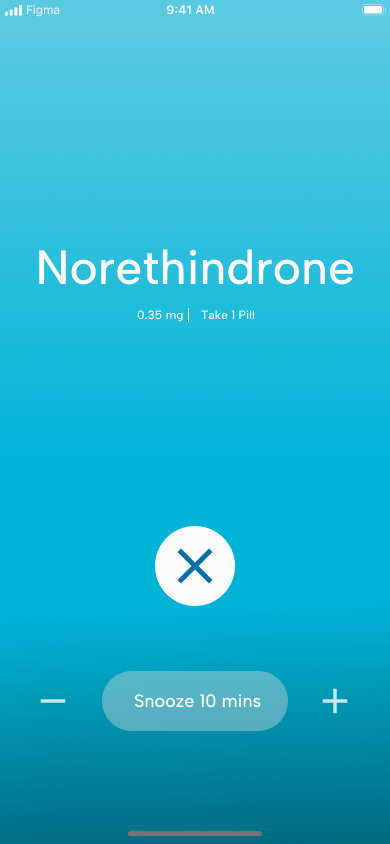
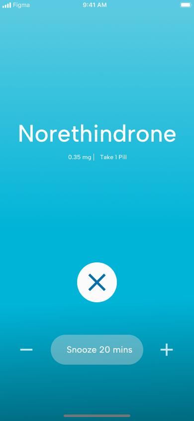
The 'Snooze' feature addresses the challenge of users being unable to take their medication during busy moments by allowing them to postpone the reminder. This ensures that the user doesn't forget to take their medication, offering a flexible and less intrusive way to manage reminders. This improves the app's overall usability and user satisfaction.
Snooze

Final Prototype
I captured the entire journey of interviewing users and refining the design in the final prototype.
If you want to check my full prototype, please click Rinah.s.design_Medicheck
Final thoughts and takeaways
Key Learnings
Users don't want to deal with unnecessary hassle, so finding ways to simplify and shorten the steps as much as possible is essential.
Users are less likely to switch to another app if the app continuously saves records.
Desired features can vary depending on the age group. It's essential to define the target audience accurately.
Next Steps
Revisit the design and refine features.
Connect to the idea of smart assistant healthcare devices.